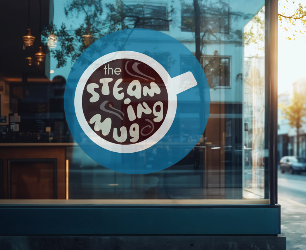
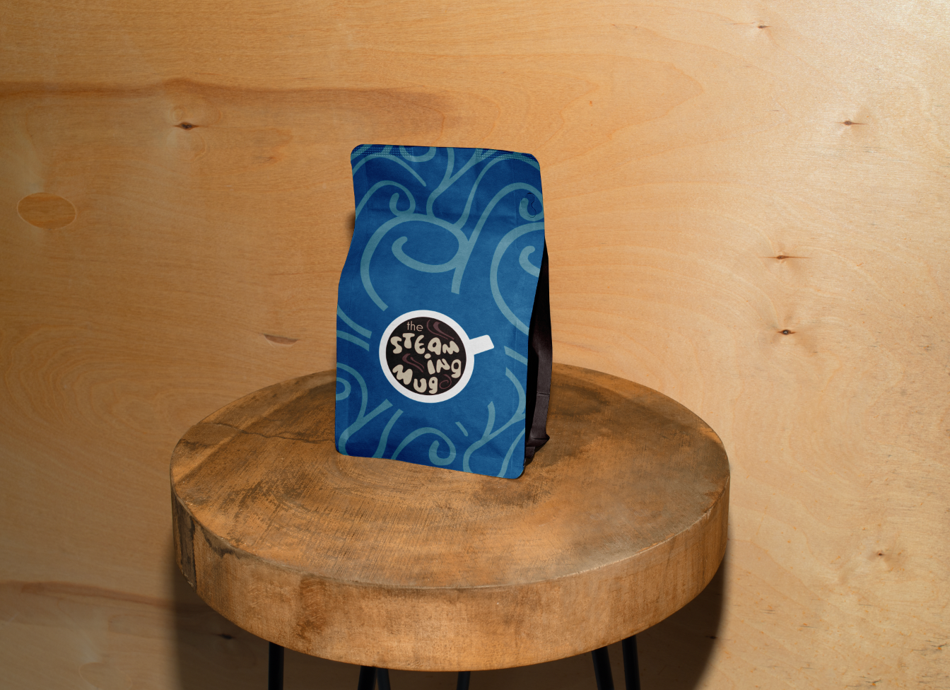
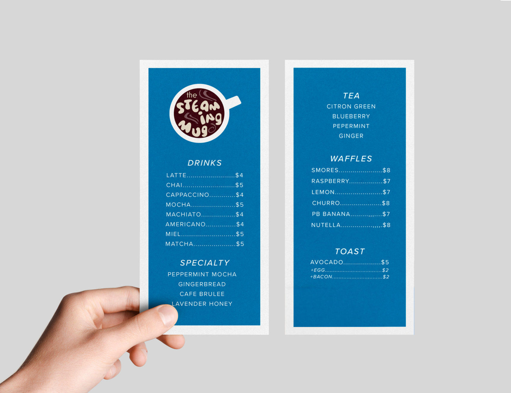
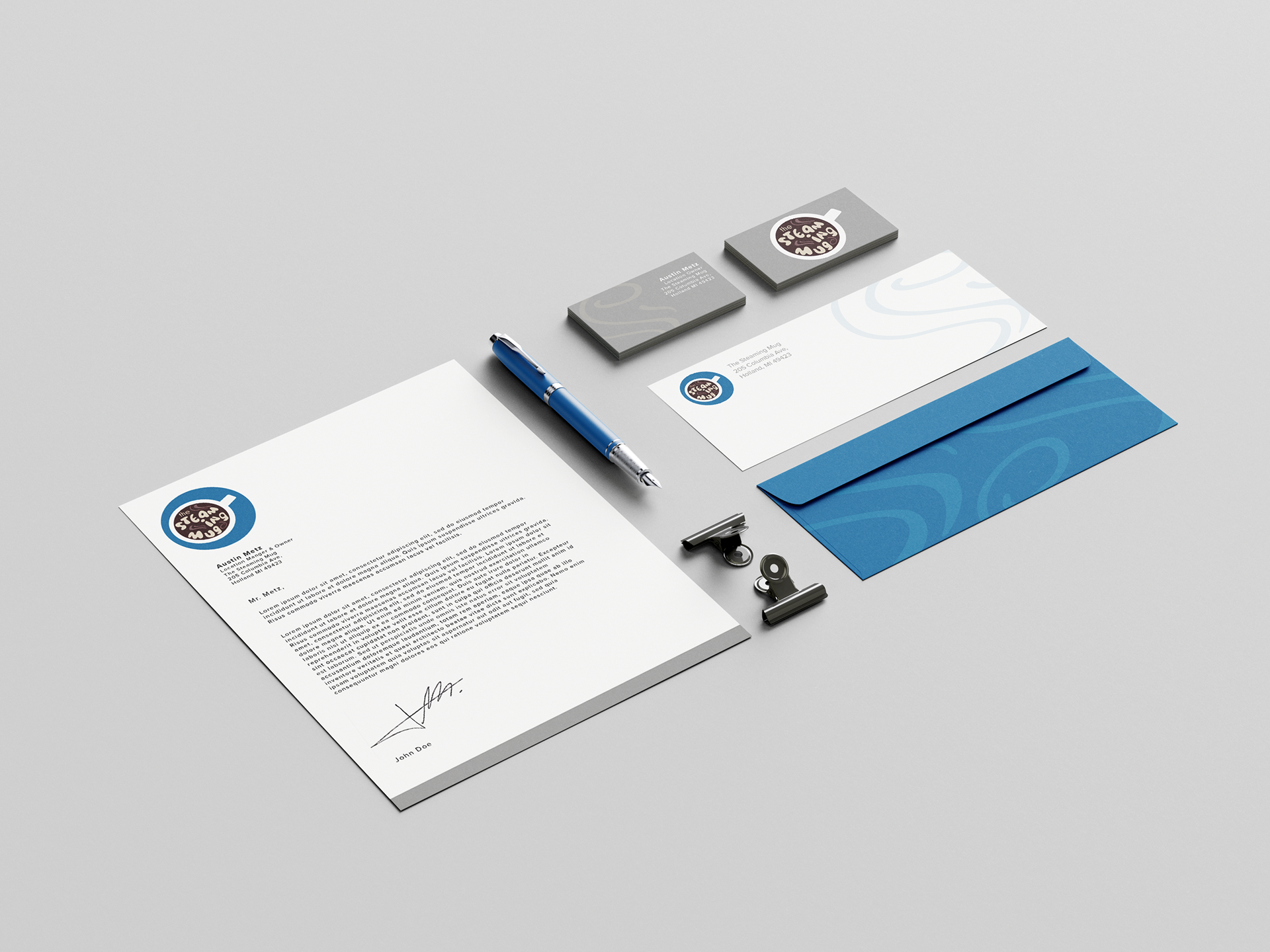
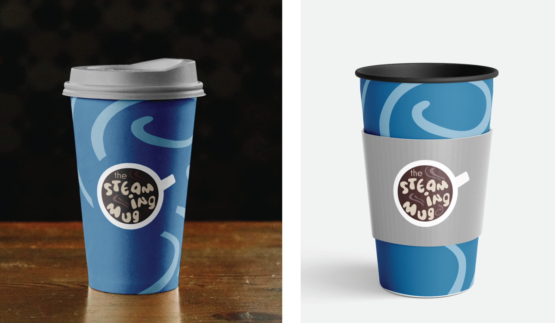
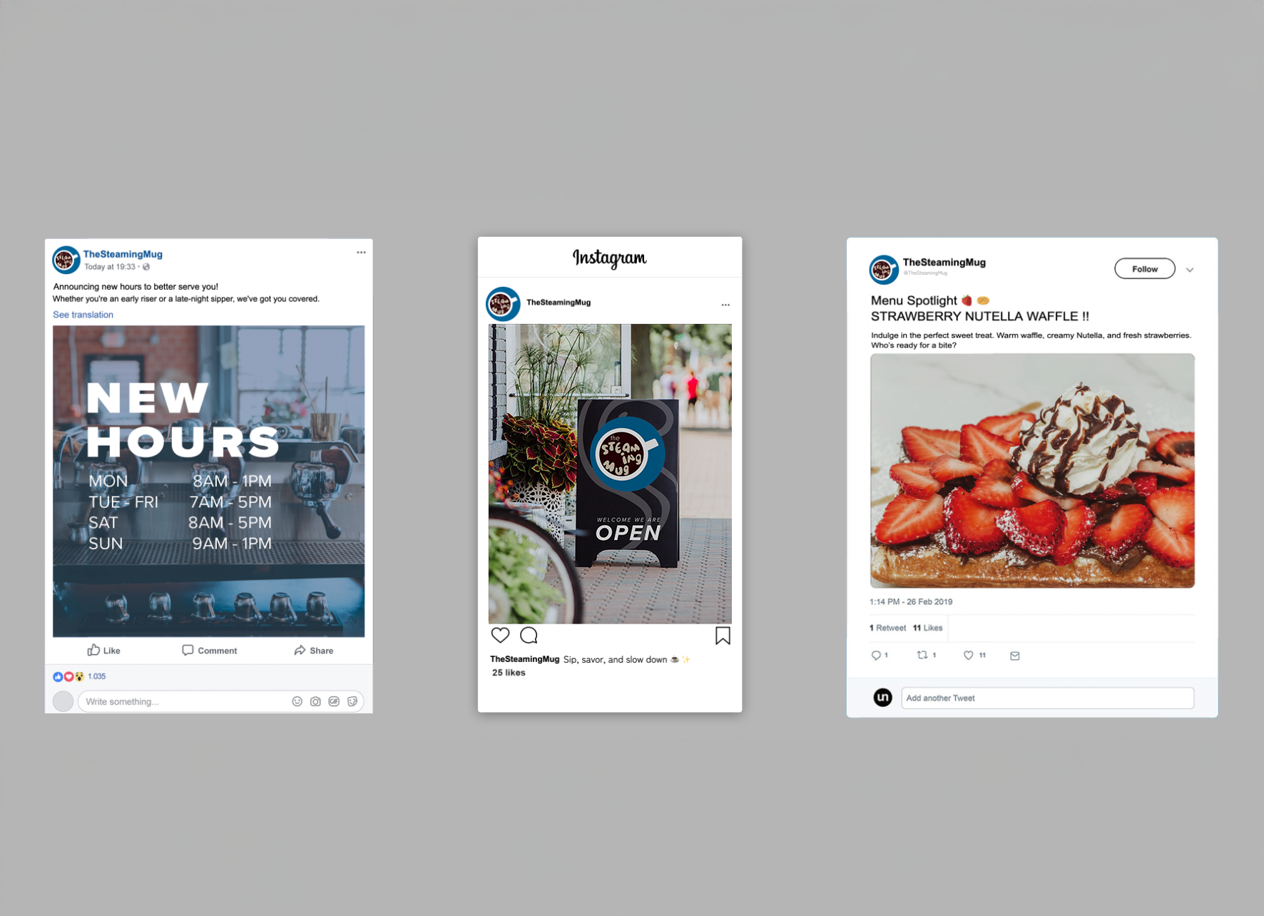
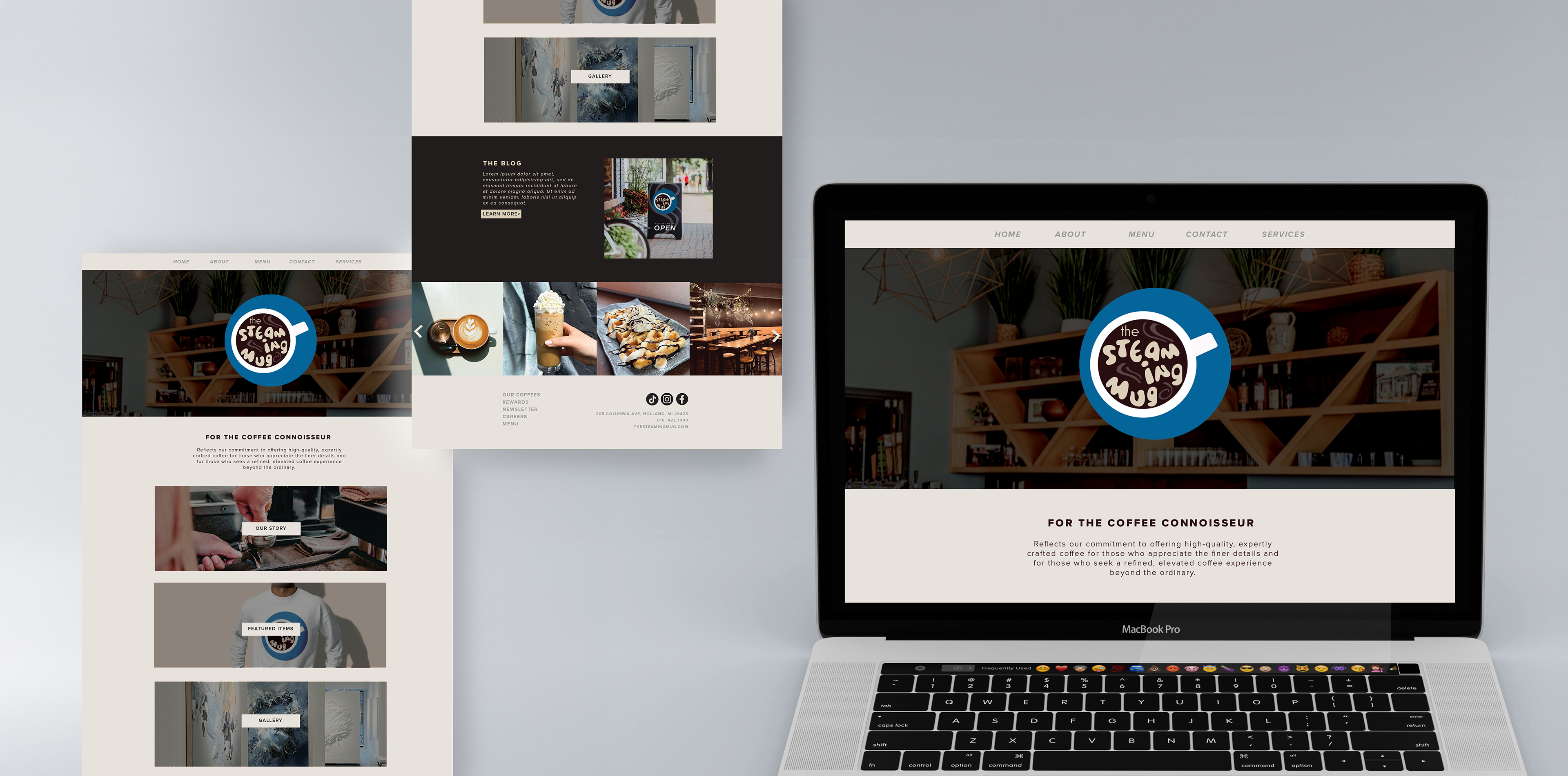

For this project, I rebranded a local coffee shop from the ground up, developing a new name, visual identity, and cohesive branding system. The circular logo references the shape of a coffee mug viewed from above, while organic letterforms and steam details add personality and movement—reinforcing the sensory experience of hot coffee and keeping the brand friendly and approachable. Through research and exploration, I selected typography and colors that support the shop’s values, ensuring consistency across all deliverables. On packaging, a repeating steam pattern extends the visual system, adding texture and cohesion to create a unified brand experience.